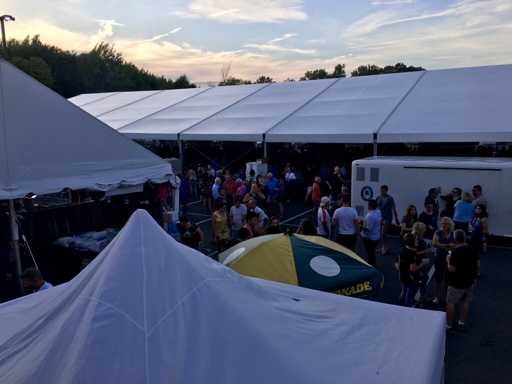
In early 2019, the festival co-chairs at my local church reached out to me regarding a complete festival re-brand. This was probably one of my favorite projects I had the privilege of working on: flyers and graphics for print and social media, menu and map tri-fold, feather flags, and more! See below:
Festival Poster
This was the main featured poster of the 2019 festival, the 41st annual summer event of our parish. The top portion of the graphic portrays the church building with it’s unique dome and cross. In the background is a large Greek flag, waving and showing its stripes and cross. Also shown in the lower portion of the flyer are the “Greek key” pattern, and the top of the well-known ionic column. Overall a well-organized document, with all the necessary information to visit or learn more online.
Festival Brochure
This is the tri-fold brochure that was mailed to hundreds of people in the Greater Cleveland and Akron area. In addition there were many on the church premises throughout the weekend.
This was the best and easiest way for guests to learn about happenings around the festival - from music and dancers to church tours. This brochure also shows all of the full menus for all inside and outside food lines.
But inside the tri-fold is my favorite part (at least now that it’s done!) and that is a map of the premises. Numbers show you how to get from the outdoors tent seating back to the main food line for a second serving of food!
Feather Flags
With the new branding, we also decided to design and buy feather flags for the front driveway of the church by the street! These two-sided flags welcome guests, and showcase some attractions the festival - including the food, music, boutiques and shops, and the drive-thru.
Other graphics
In addition to these larger feature graphics, there were also many other smaller details that made a big difference. Gift cards for the festival were ordered and needed to be designed with the new branding, and numerous social media graphics helped draw crowds!

